
RealClear Media
Designing a scalable editorial platform for modern news consumption.
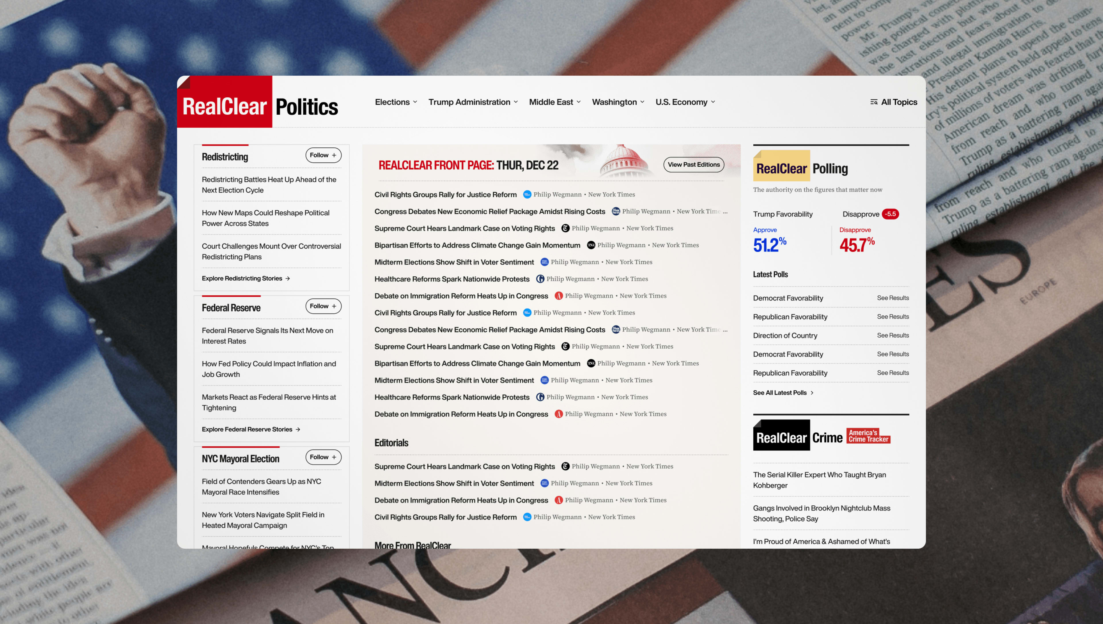
News readers don't visit to browse. They arrive with intent. Whether it's breaking news, elections, or long-form analysis, the experience must surface information immediately while remaining easy to scan.
Our goal was to redesign the editorial experience around clarity, hierarchy, and speed.
Role: Visual design by creating components/modules in the design system by tokenizing across 15 sub brands.
Prioritize information density.
News platforms should expose more content—not less. We embraced a high-density layout that increases discoverability while preserving readability through strong visual hierarchy.
Familiarity builds trust.
Rather than reinventing the browsing experience, we preserved the familiar left and right rail structure that returning readers already understood. The redesign focused on improving clarity instead of changing behavior.
Focus attention where it matters.
While supporting multiple content streams, the primary news experience always remains anchored in the center column. Secondary information provides context, never distraction.
The platform balances familiarity with modern editorial patterns. A persistent left rail supports navigation. The right rail surfaces context, trending stories, and related content. Meanwhile, the center column remains the primary reading surface, allowing breaking news to dominate above the fold.
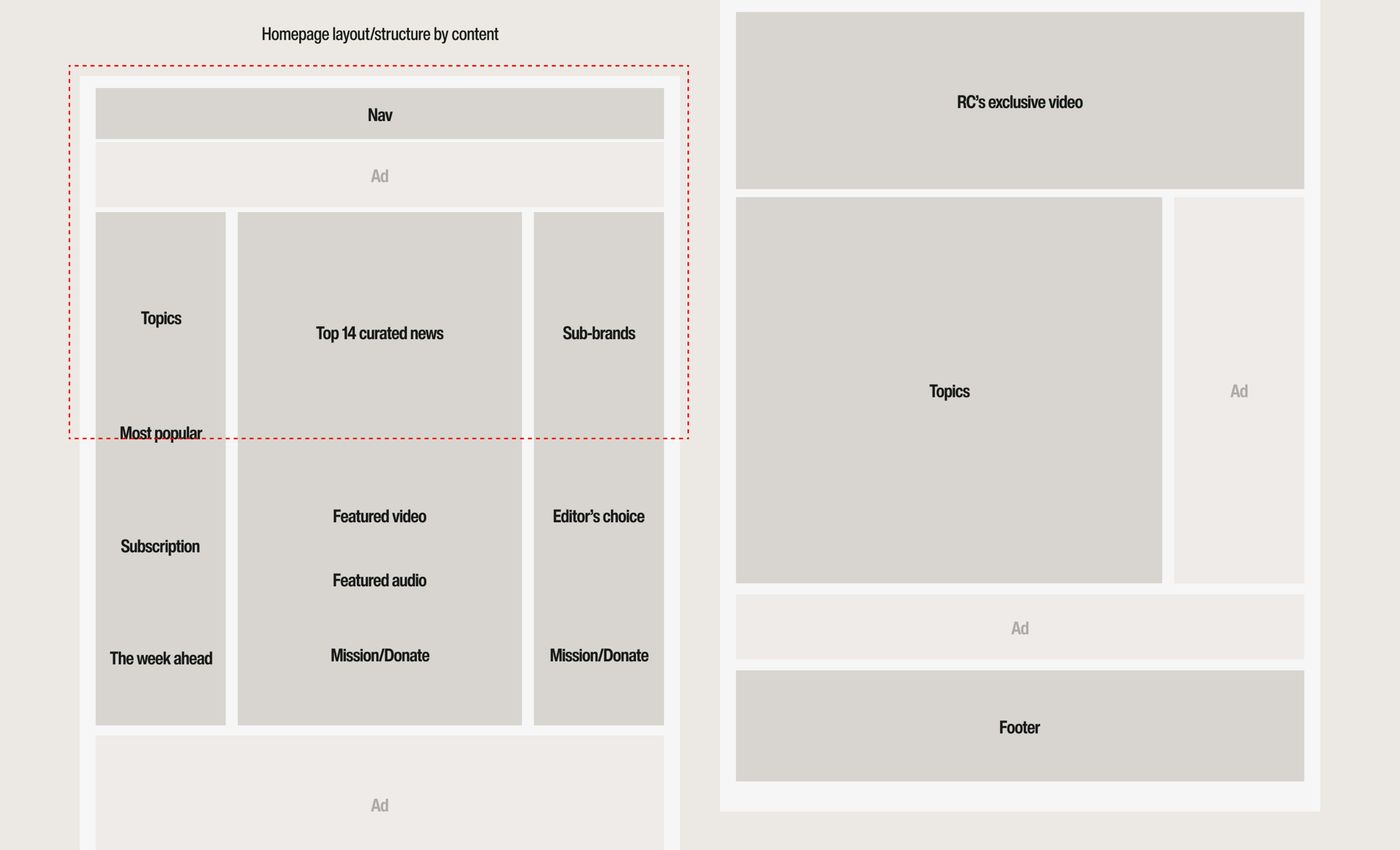
The visual language was designed to support a content-first editorial experience.
Rather than introducing expressive graphics, every visual element was created to improve readability, strengthen information hierarchy, and scale consistently across fifteen independent publications.
The result is a flexible design language that feels familiar to returning readers while allowing each brand to maintain its own editorial voice.
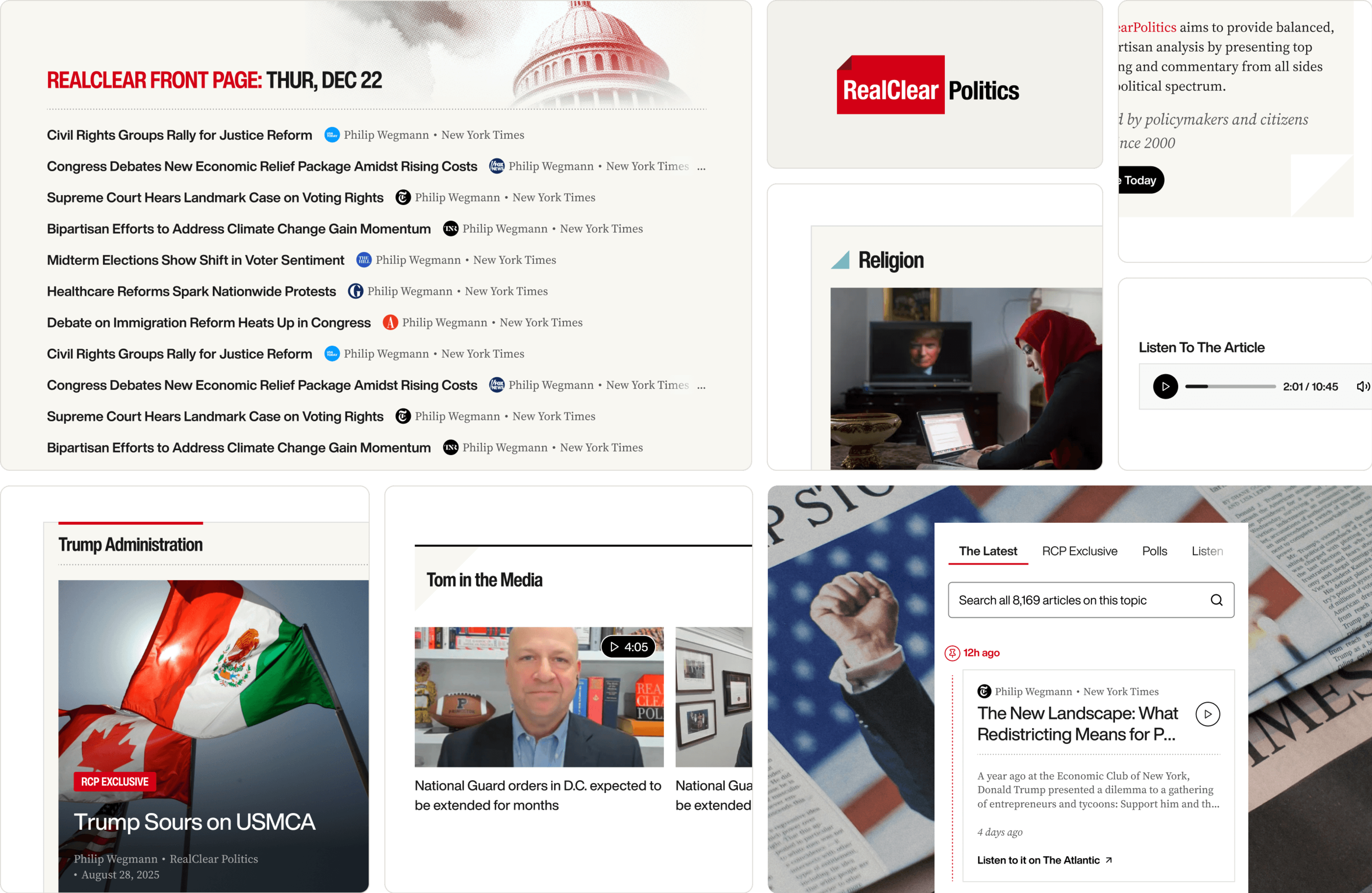
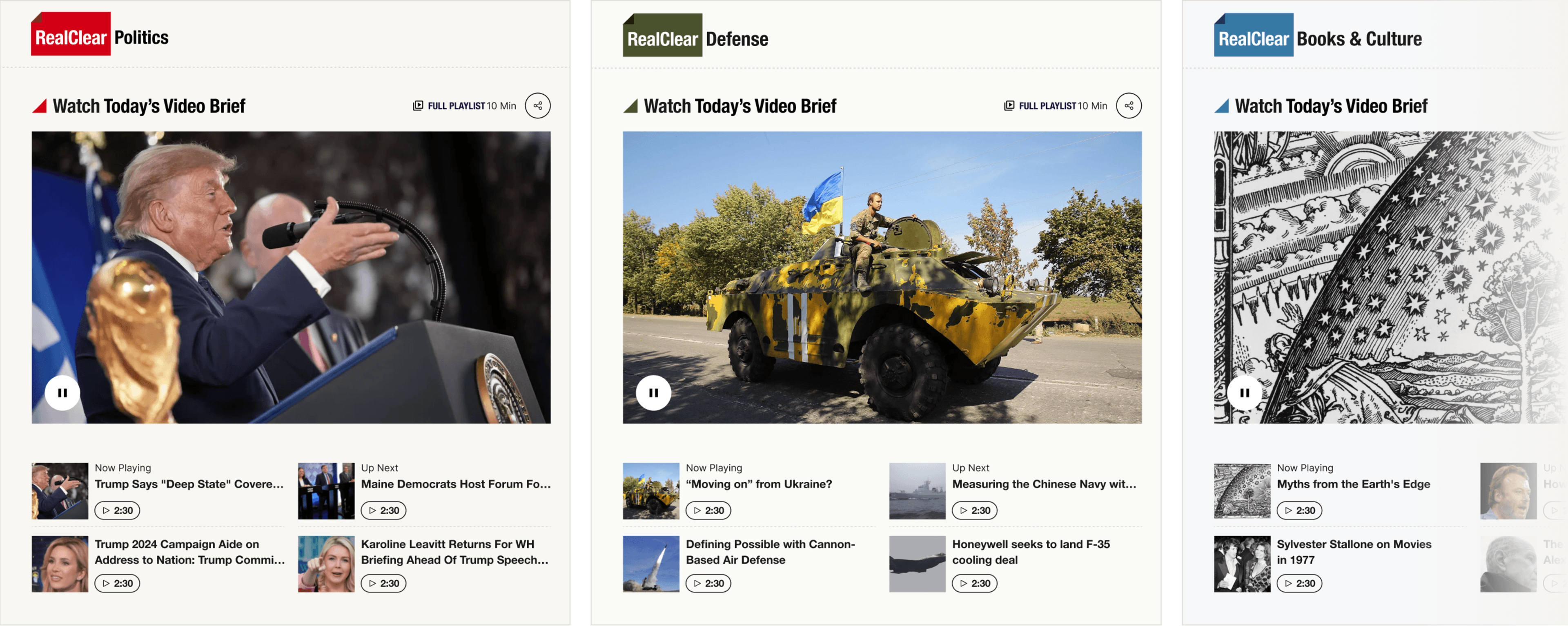
A. Brand Themes
A flexible theme system was created for all fifteen publications, allowing each sub-brand to maintain its own visual identity while sharing a unified editorial framework. This approach balances brand individuality with a scalable design system.
B. Editorial Typography
Helvetica Now provides a broad range of weights to establish clear hierarchy across headlines, navigation, and metadata, while Source Serif enhances readability for long-form articles. Together, they create a balanced rhythm for high-density editorial content.
C. Editorial Signals
Subtle visual signals help readers process information more efficiently. A horizontal color bar highlights topic-based content, while colored triangles introduce related stories from other RealClear publications, reinforcing each sub-brand's identity without distracting from the reading experience.
D. Reinventing the Front Page
The RealClear Front Page has long been a familiar destination for returning readers, so we preserved its core structure while modernizing the visual experience. By introducing stronger typography, cleaner spacing, and selective imagery, the redesigned front page improves scanability and keeps the latest stories clearly prioritized above the fold.
Every visual decision serves the editorial experience. Typography establishes hierarchy. Color communicates context. Brand themes preserve identity. Layout prioritizes speed. Together, these elements create a scalable visual language for a modern publishing platform.
Rather than creating twelve independent products, we built one scalable editorial system. Shared components, layout rules, and typography created consistency, while allowing each publication (total of 15 sub brands) to express its own editorial identity.
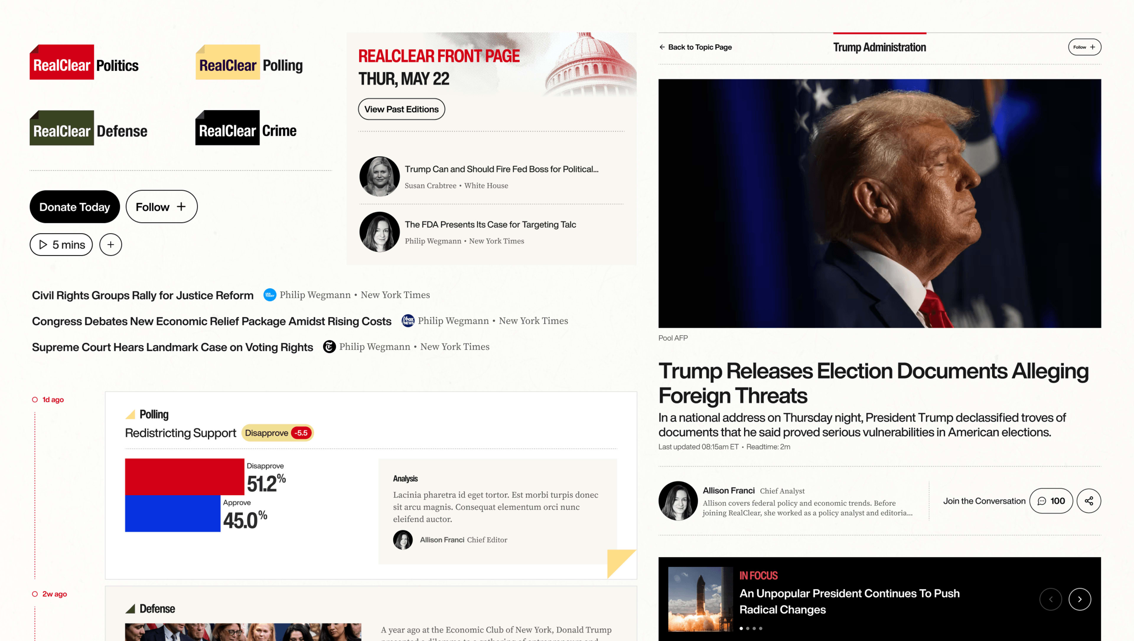
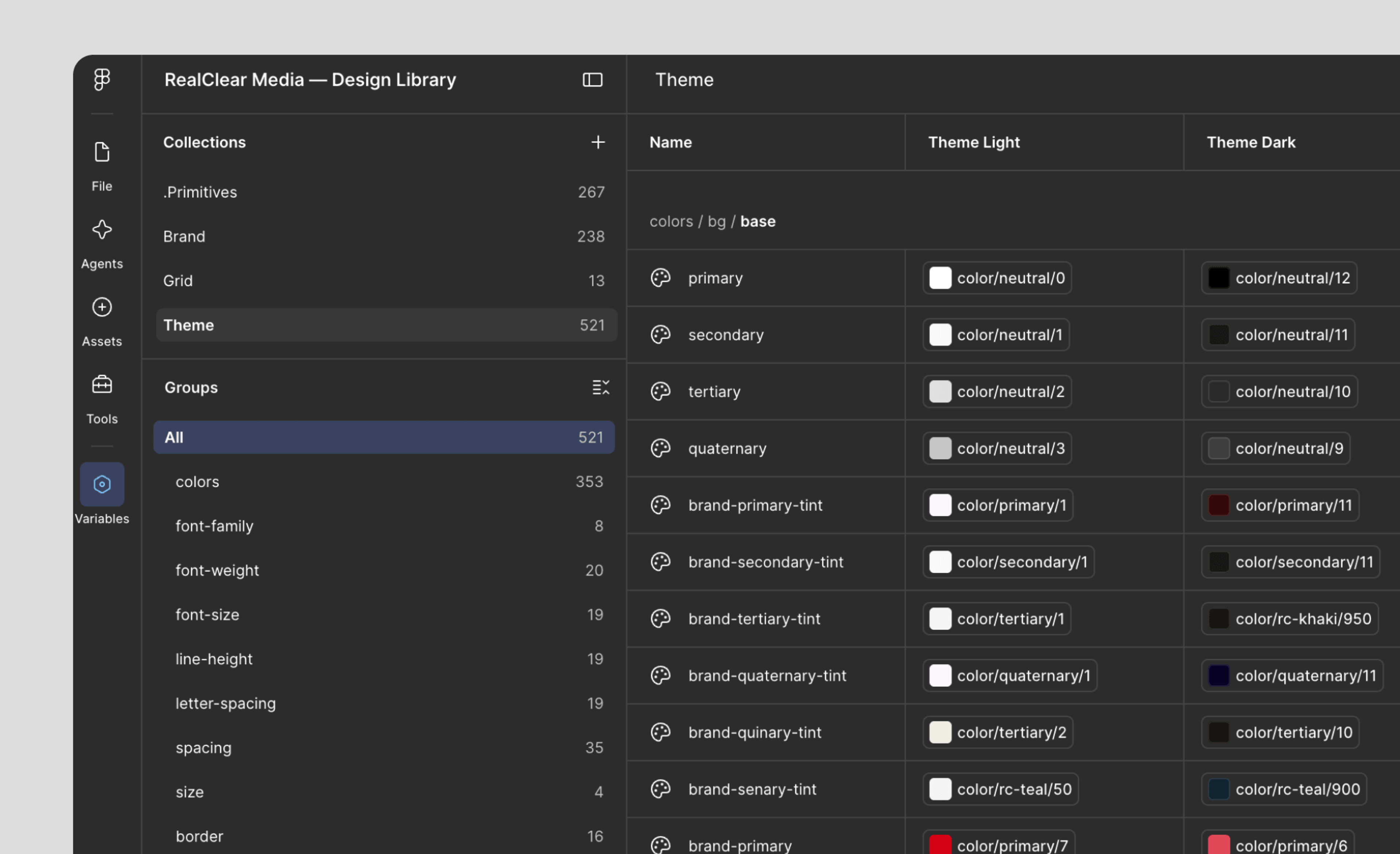
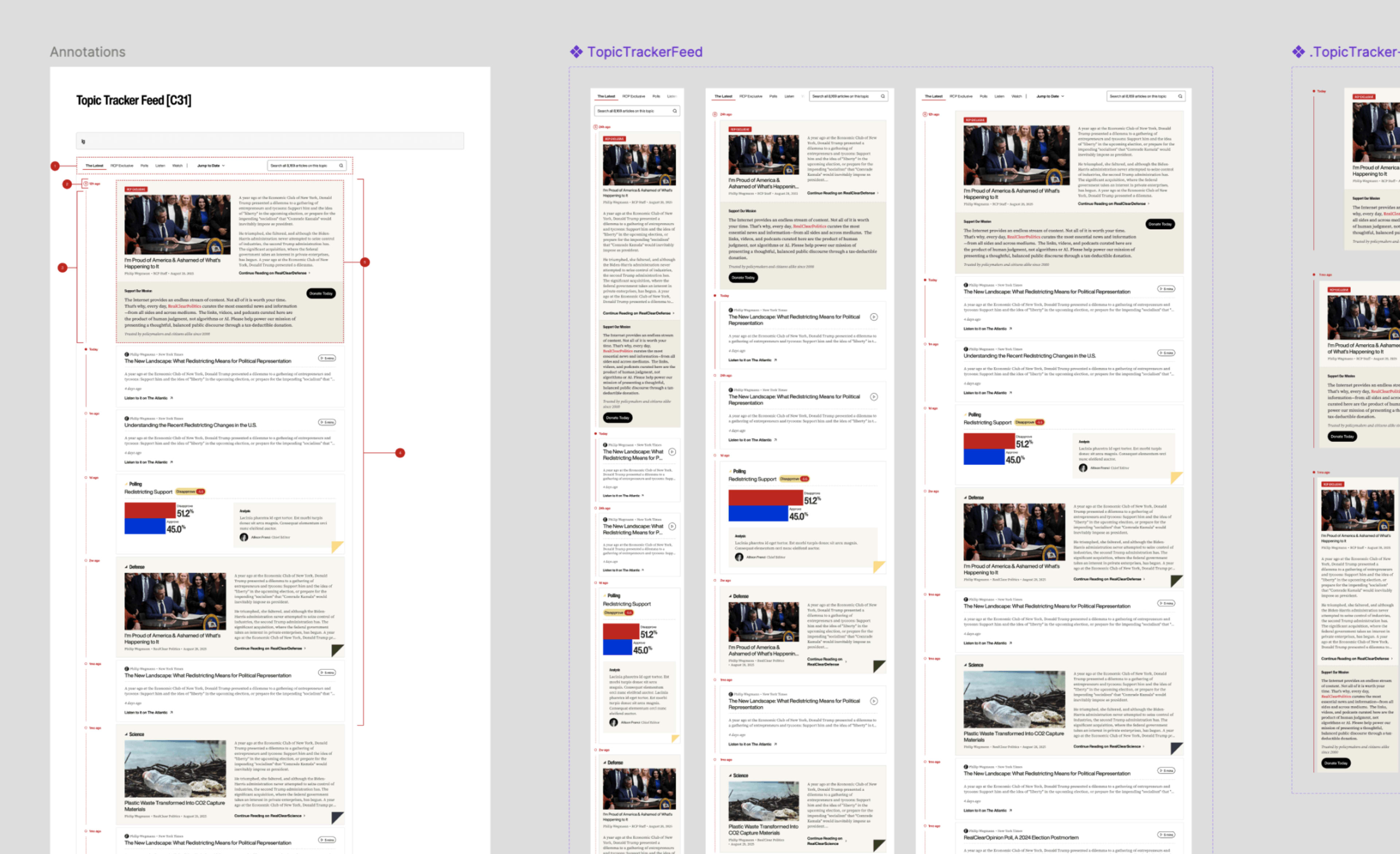
The final interface transforms the design system into a cohesive reading experience. Responsive layouts, clear visual hierarchy, and consistent interaction patterns work together to help readers quickly find, scan, and engage with the stories that matter most.
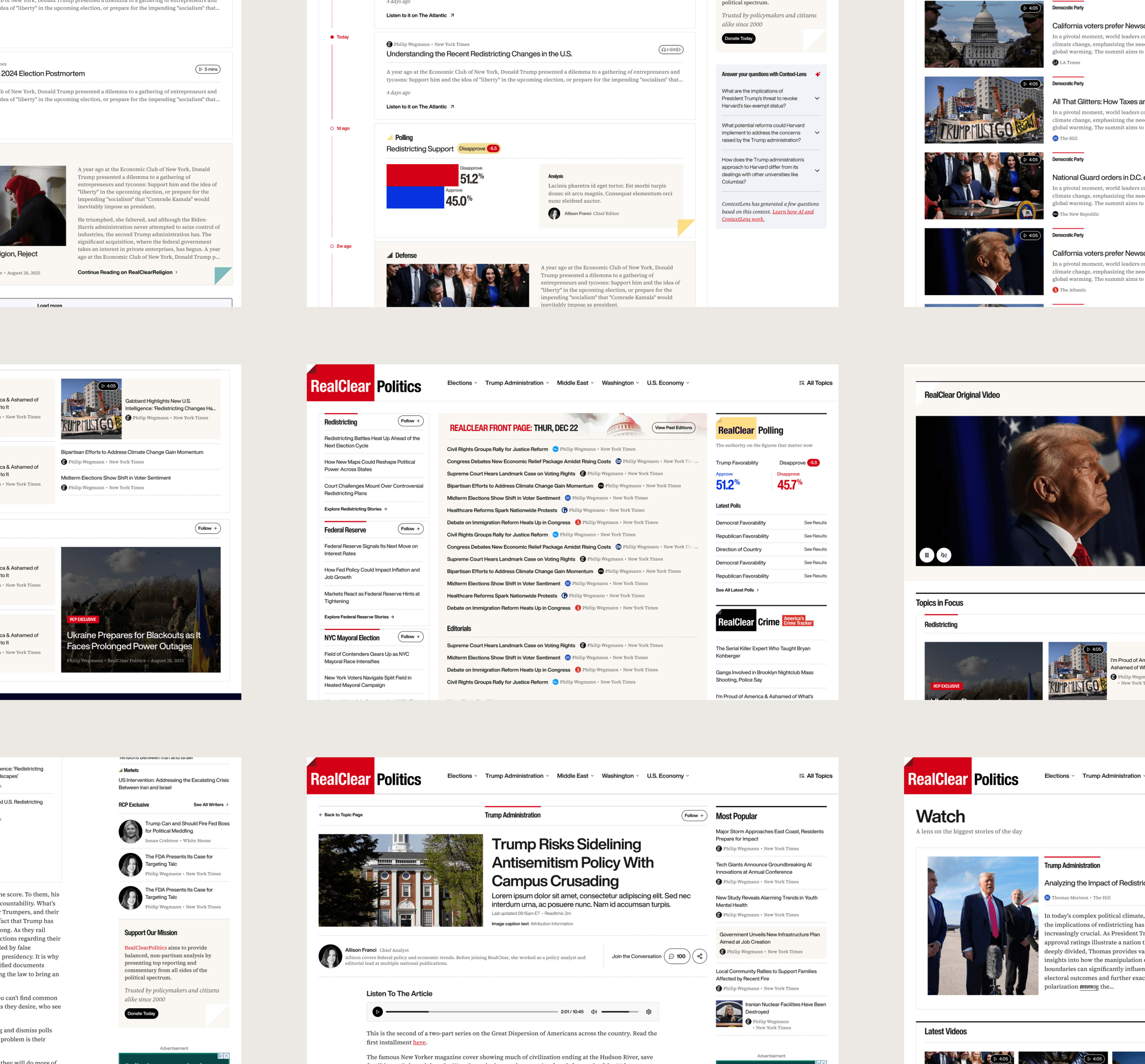
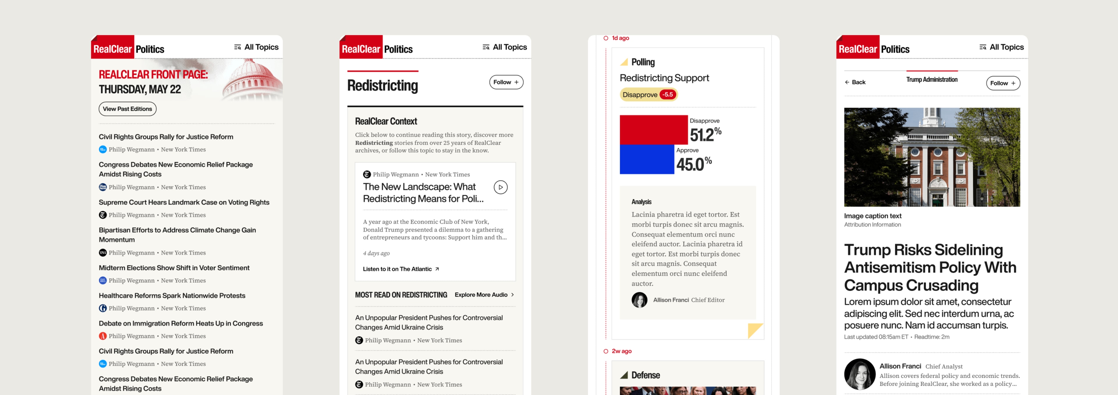
The project aligned editorial, product, and engineering teams around one scalable publishing platform. Rather than designing individual websites, we established a shared foundation that future brands can adopt, extend, or customize without rebuilding the experience. The redesign wasn't about making news look different. It was about helping readers process more information with less effort, while giving every publication a scalable foundation for future growth.
15 / 238+
Brand Themes / Tokens
521
Design Variables
1
Scalable Foundation
One design system. Fifteen editorial brands. A shared visual language built on 521 design variables.