
Wyshbox
A modern digital term life insurance product, building a brand from 0 to 1.
Life insurance is something people put off. The category felt cold, complicated, and built on stock photography of smiling families.
Wyshbox, a modern digital term life insurance product, set out to change that. Our goal was to build a brand that felt human and approachable, without losing the trust that insurance demands.
As Director of Design, I led the brand from zero to one while staying hands-on across art direction, UI/UX, motion, and the design system, leading a team of 5.
Playful, but trustworthy.
Insurance is serious, but it doesn't have to feel heavy. Every decision balanced warmth with credibility.
Human, not stock.
Real people in everyday moments, drawn with care, instead of the polished photography the category relied on.
One system, every touchpoint.
The brand had to work as well in a banner ad as it did inside the product.
The product was built around one simple idea: your "Wyshes." Instead of asking people how much coverage they need, we asked what they want to protect, like paying off a mortgage, covering a child's tuition, or leaving a legacy.
That idea shaped everything, from the name and logo to the product flow and the campaign.
The identity was designed to feel playful but trustworthy, protective but adaptable.
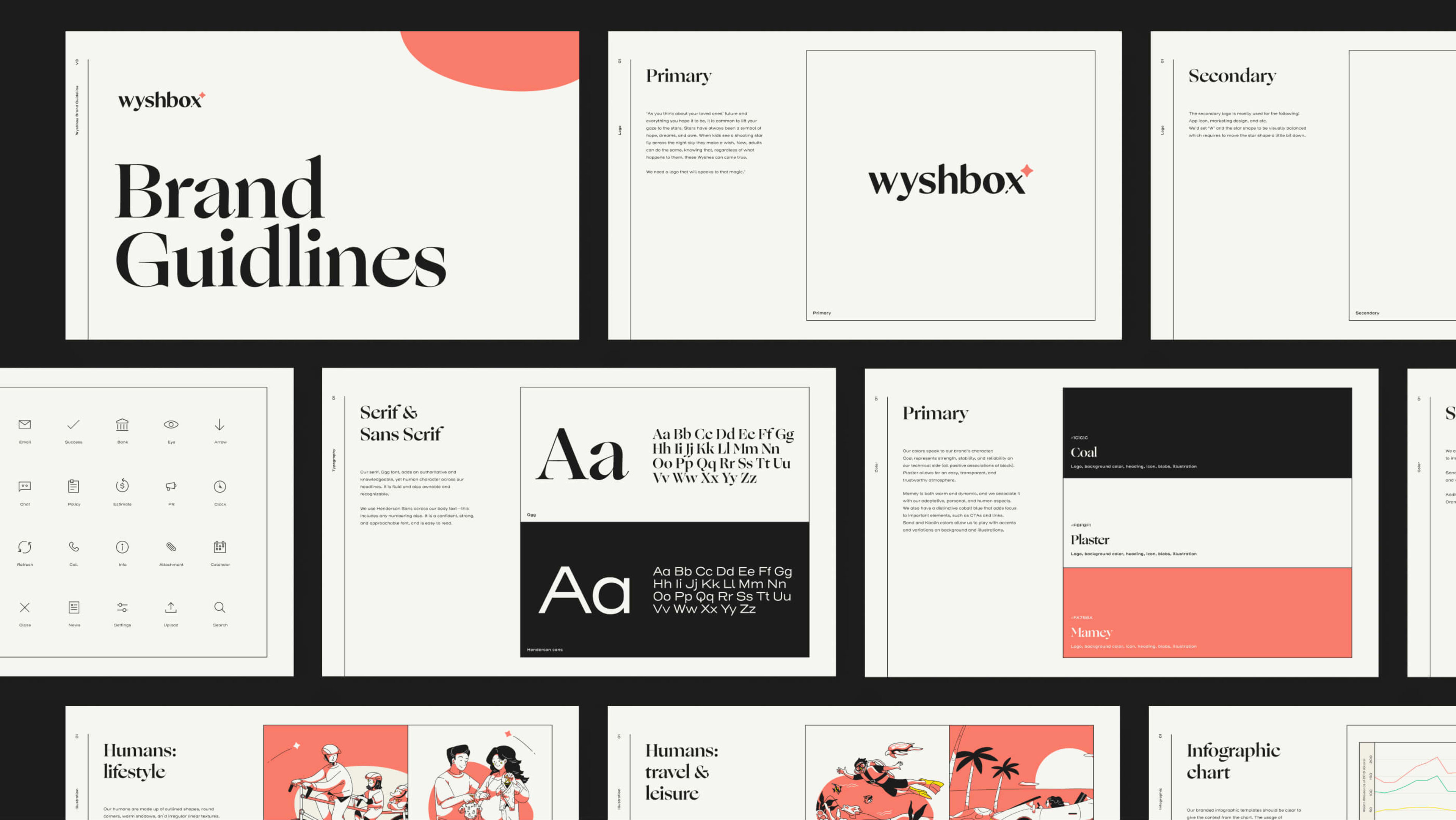
Logo
Named after a wish and inspired by shooting stars. A customized wordmark built on top of Ogg, with a star mark that carries across the system.
Color
Coal for stability and Mamey for warmth, grounded in Plaster, breaking from the category's cold palette. Secondary and tertiary palettes extend the system across product UI and data.
Typography
Ogg gives the brand an authoritative yet human voice, paired with Henderson Sans for clarity across product and marketing.
Illustration
Competitive research showed the category leaned heavily on photography, so we chose illustration instead. The system is built on three elements, Humans, Blobs, and Wyshes, showing real people in their everyday lives.
Motion
Subtle animation across the illustrations made the brand feel more approachable than anything static could.
Every visual decision served one goal. Color brings warmth. Typography builds trust. Illustration makes it human. Motion brings it to life.
The same system had to work inside the product and everywhere we brought people in.
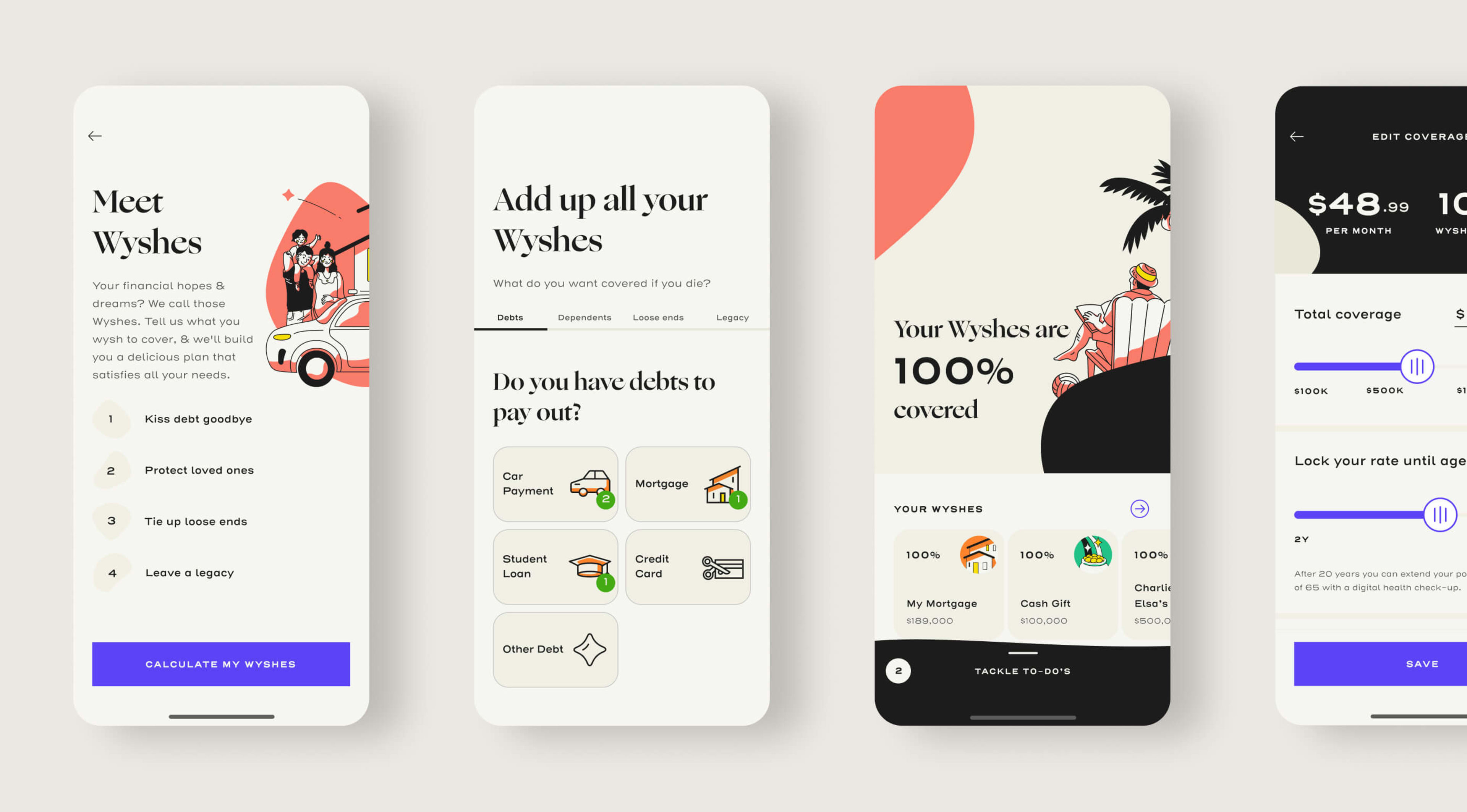
A. Mobile / Web App
Built around adding up your Wyshes and seeing them covered. I led the design and branding of every step of that journey.
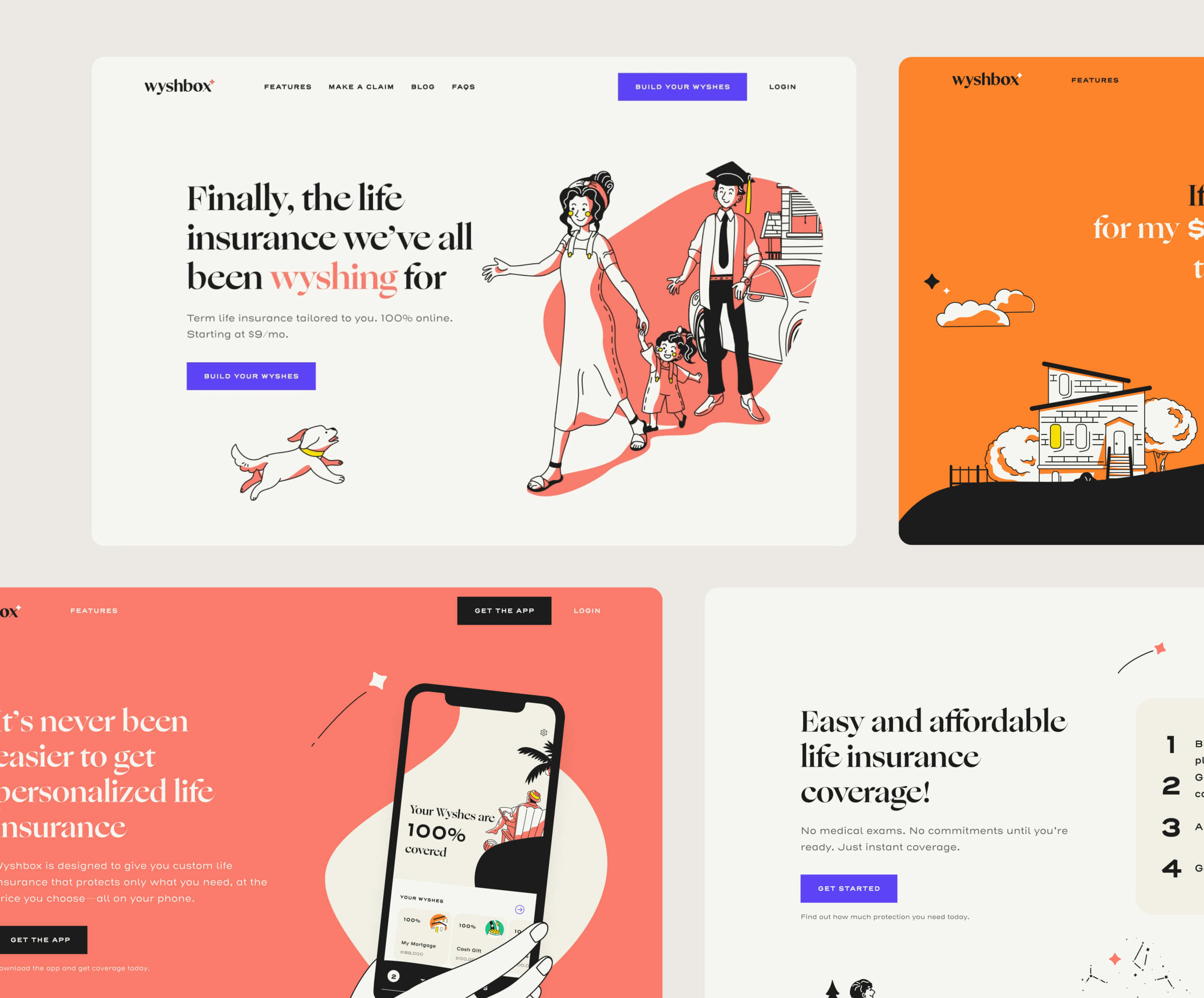
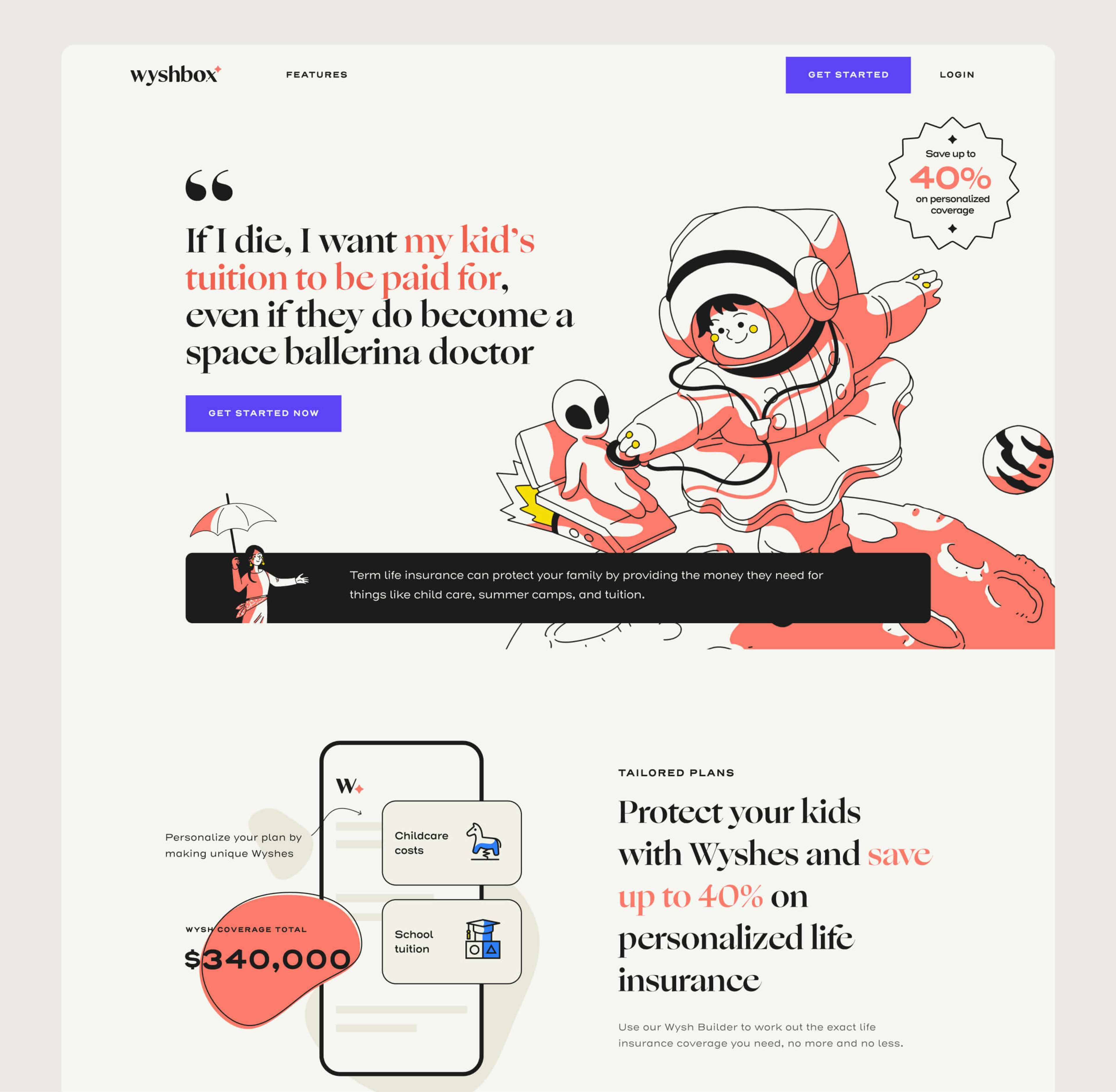
B. Website
Playful copy paired with the same illustration system, built to make people actually want to engage with an insurance product.
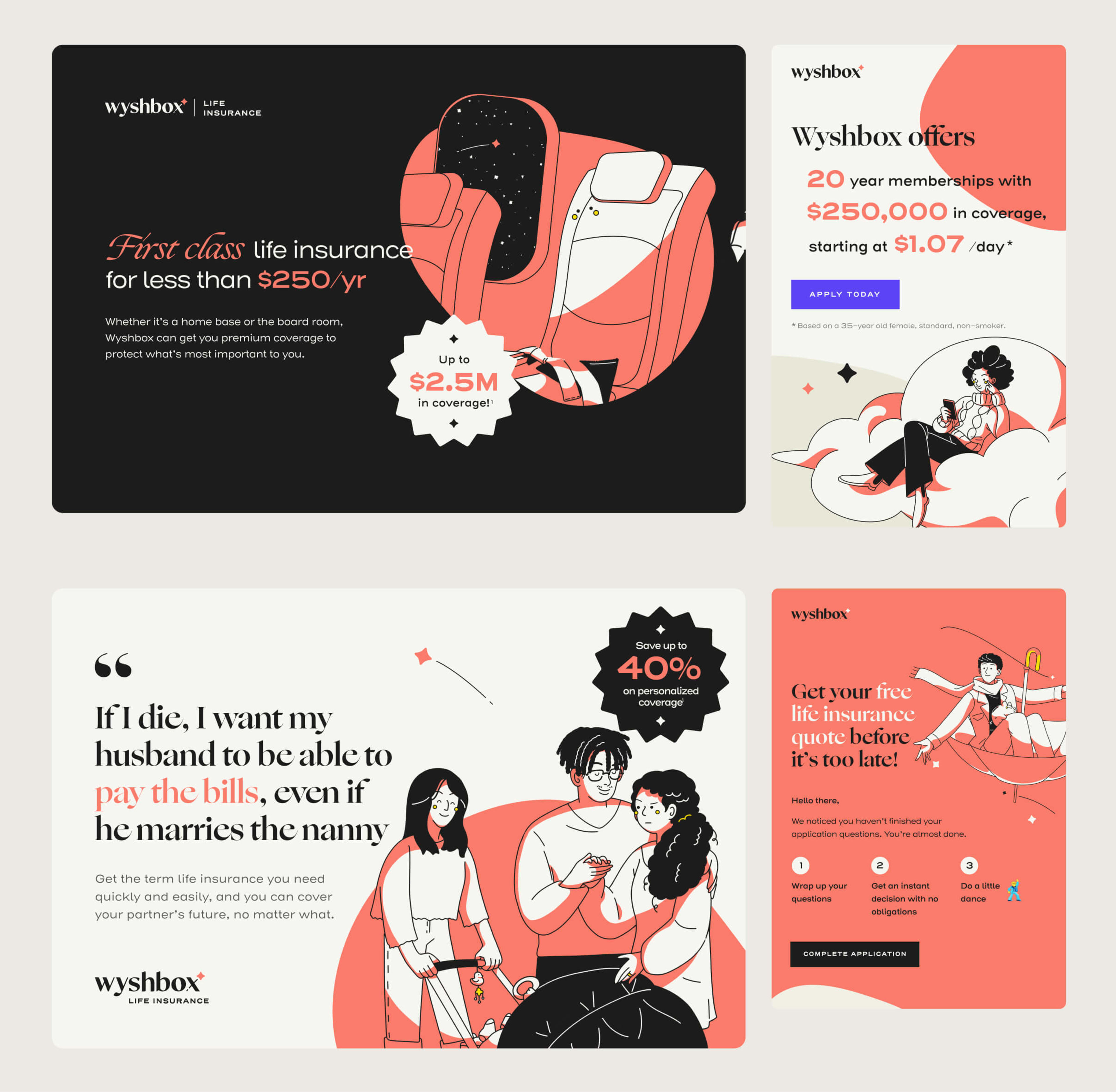
As our first campaign, "What's Your Wysh?", the focus was brand awareness. We went digital-first, putting the same idea into different contexts and messages to learn what landed.
A. Streaming Video
Illustration and motion carried into video, so the brand felt as warm in a short spot as it did in the app.
B. Social Story Ads
Designed motion-first for social, with each frame flowing into the next as one connected story.
C. Digital Banner Ads
Tested message angles across formats, from the practical to the playful.
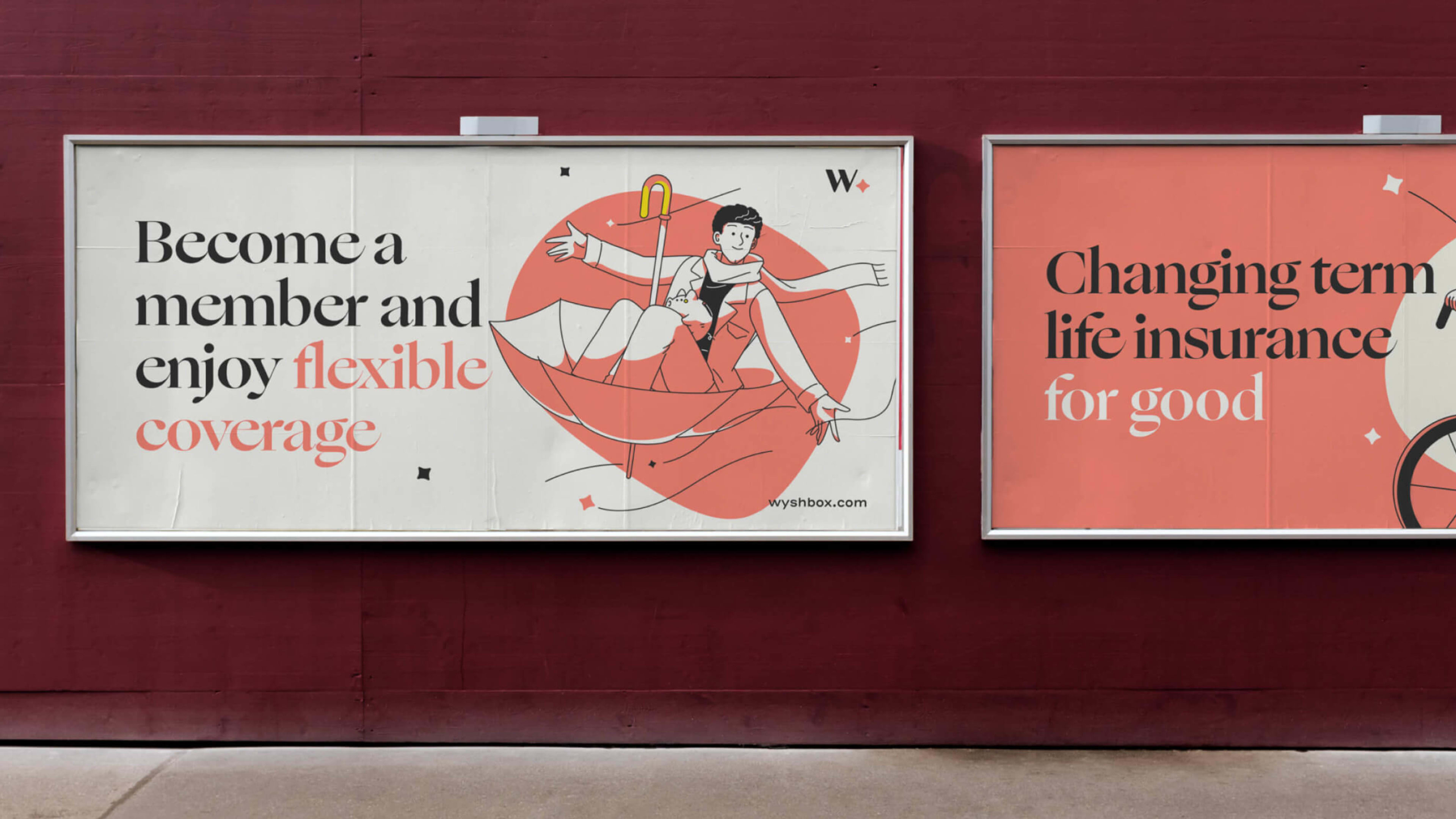
D. Billboard Concept
Mocked up to define how the campaign would scale into out-of-home, setting the design direction for future use.
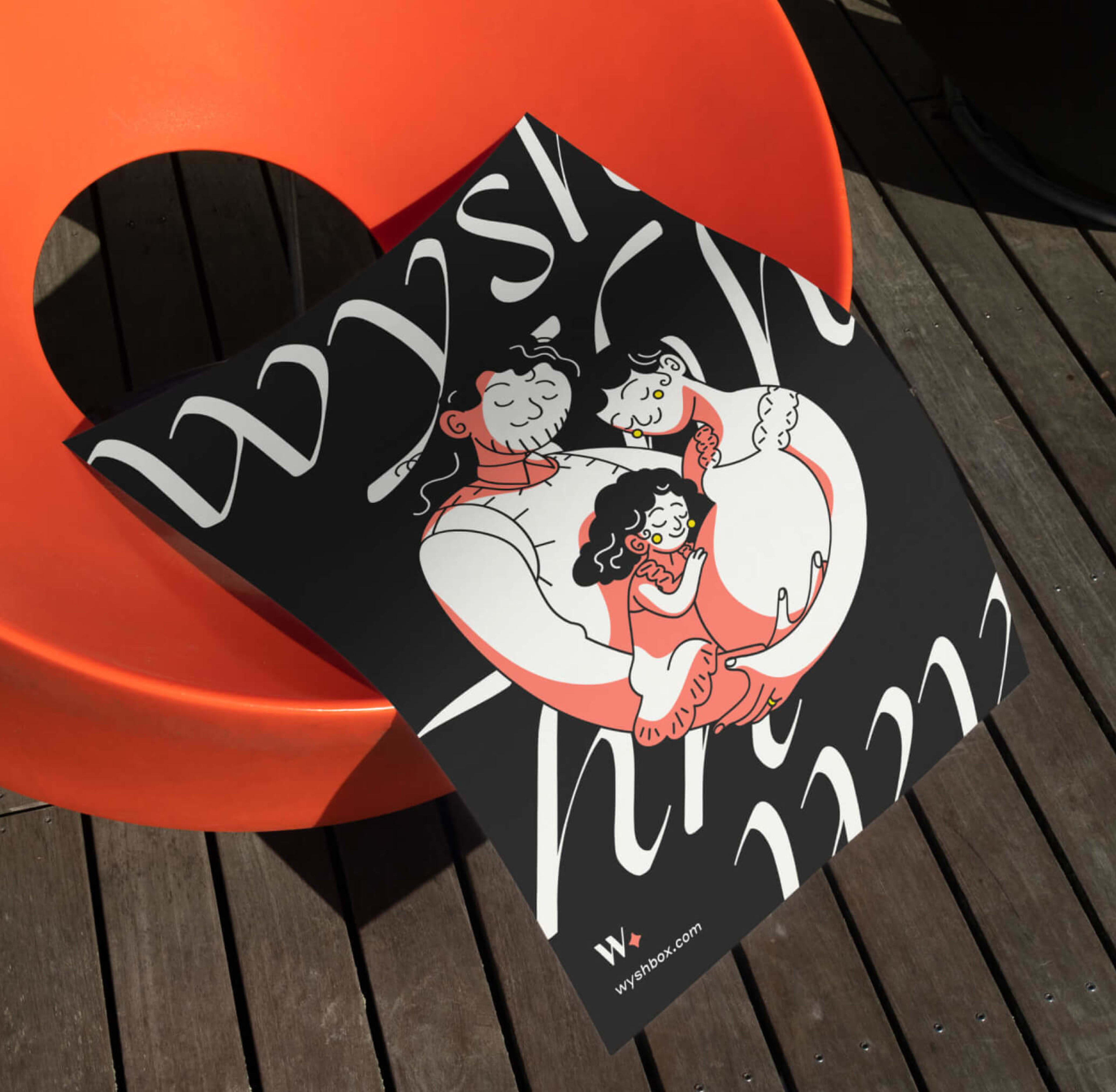
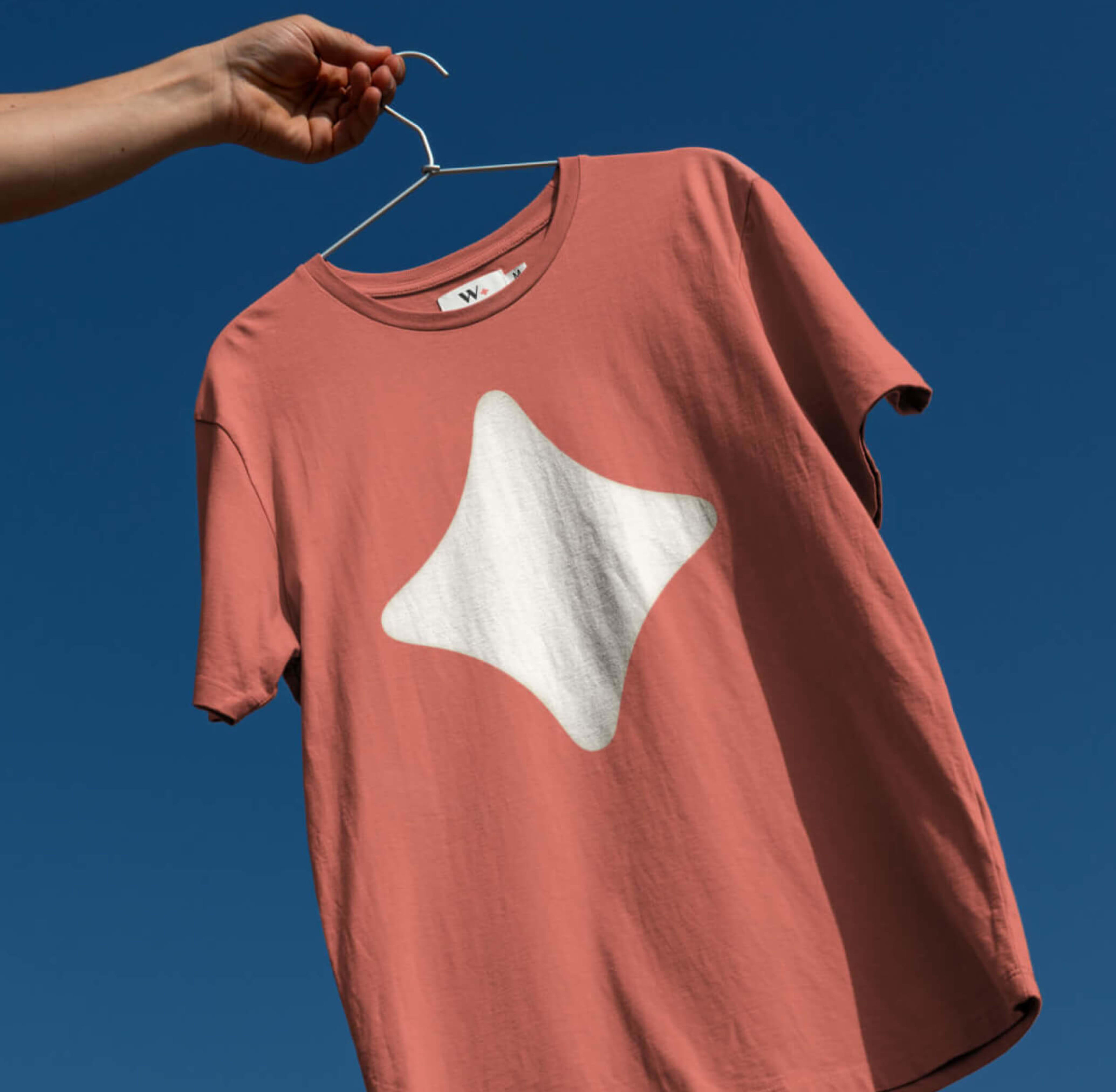
E. Brand Explorations
Social posts, infographic templates, and merch, mocked up to stress-test how far the system could stretch.
Building a brand from zero meant making every decision for the first time, with no existing system to lean on. I led by doing. I personally directed the illustration style, stayed hands-on across visual design, layout, and motion, and guided a team of 5 to carry the system across product, marketing, and campaign. The work wasn't about making insurance look fun. It was about making something people avoid feel human, approachable, and worth engaging with.
0 to 1
Brand & Experience
9+
Touchpoints, from product to campaign
1
Featured by UnderConsideration's In-house In-Focus
One brand system. Built from zero. Scaled from product to campaign.